
Parkinson's Africa goes live
 Posted: 13 April 2023 by: Leeroy Lugg.
Facebook /
WhatsApp /
Bluesky /
Mail
Posted: 13 April 2023 by: Leeroy Lugg.
Facebook /
WhatsApp /
Bluesky /
Mail
give or take.
Parkinson's Africa approached us when they realised that their Wix website was not effectively conveying their unique message and promoting their cause. While the charity has made some progress in terms of identity and branding by choosing colours, designing a logo, and selecting the Google font 'Poppins' for page typography, we collectively decided to restart the process to ensure a more focused approach.
Our goal was to create a visually appealing and user-friendly website with an uncluttered design prioritising ease-of-use and readability. To achieve this, we began by defining the target audience and discussing specific functionality requirements, allowing us to structure the pages accordingly.
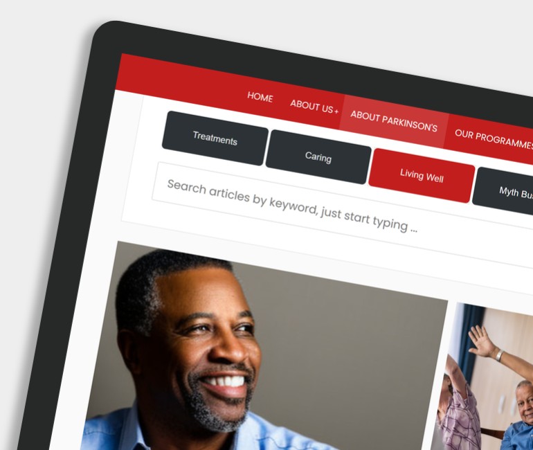
The homepage & branding
For the homepage, the charity requested a large masthead section with centralised navigation, creating a prominent and easily accessible focal point. In terms of colours, we opted for a combination of red, charcoal, and off-white, which aligns with the charity's branding.
Screen Shots
Keyboard navigation
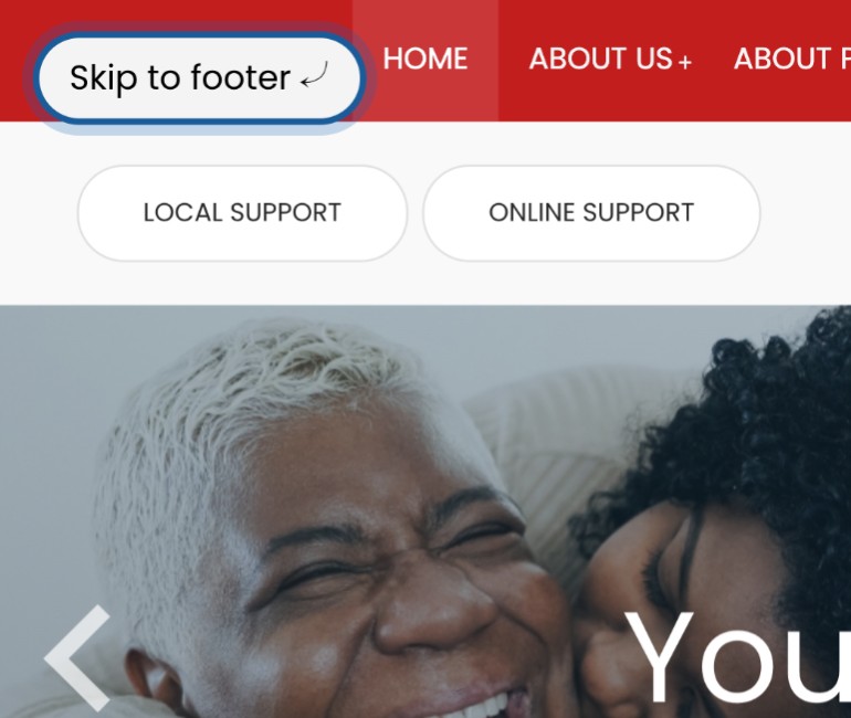
Considering that some visitors may encounter challenges while browsing the website using a mouse, we paid special attention to developing good keyboard navigation. We incorporated styled 'skip-links' (activated via keyboard tab-key) to enhance page navigation, and the primary drop-down menu was implemented using smartmenus.js.
This choice not only optimised keyboard navigation but also ensured a seamless user experience across various devices, including phones, tablets, and desktop browsers. We also took keyboard navigation into account while developing the website's sub-navigation and tabs.
Table of Contents (TOC) menu
The article section benefits from the inclusion of an automated Table of Contents (TOC). By simply styling the sub-headings of an article with either h2 or h3 tags, website editors can easily generate a dynamic TOC menu.
The TOC serves as a handy reference tool for visitors who may need to read specific sections or topics. Whether it's for study, research, or review purposes, visitors can quickly locate the relevant sections without having to scan through the whole document. This feature is particularly useful for long or more complex articles.
Summary
Overall, our approach involved a fresh start, emphasising user-centric design, accessibility, and seamless functionality to ensure that Parkinson's Africa's website effectively communicates their message and engages their audience.
Parkinson's Africa manage their website using ProcessWire.
Comments are closed on this post.