
Five simple ways to improve mobile website navigation
 Posted: 19 January 2019 by: Leeroy Lugg.
Facebook /
WhatsApp /
Bluesky /
Mail
Posted: 19 January 2019 by: Leeroy Lugg.
Facebook /
WhatsApp /
Bluesky /
Mail
give or take.
It's always important to create great looking, usable website navigation – and perhaps even more so for smaller touch-based screens. Make life a little easier for your mobile visitors by building these five suggestions into your website:
1. Ensure there is enough ‘tapping’ space: Make sure that individual menu items are not positioned too close together. In a stacked menu, for example, a little extra vertical space will make selecting menu items with a finger much easier. This is particularly helpful if your visitor has any hand/eye co-ordination or dexterity issues.
2. No more than eight: As a rule of thumb, primary (top level) navigation should be no more than eight pages. This will reduce the number of links that are displayed on a phone screen when the menu is activated and also make general desktop navigation easier. Additionally, keep the menu titles short and concise: if your menu titles are too long, they will wrap – making your navigation look cluttered and unprofessional.
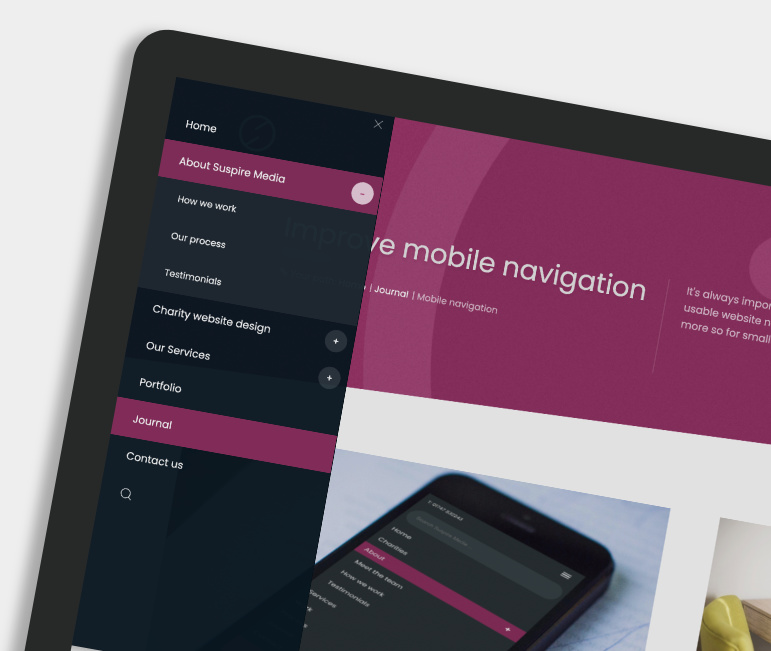
3. Use a multi-level/multi-toggle menu: If your website structure is large or complex, use a multi-level, accordion style menu (as used on this website). This will enable site visitors to easily drill-down through the site's hierarchy and find the page or section they are looking for. It's also important to create a navigation system that allows the user to tap and visit all the pages displayed on the menu - avoid navigation systems that try to mimic software menus. If it's practical, perhaps consider placing the website search-field with the menu (as in the screen-shot above).
4. Use contextual links: Make life easier for your visitors by using lots of relevant contextual links within your page content. This will help your visitors move through your site in a more organic way without having to solely rely on the navigation menu.
5. 'Back to Top' button. Single-column design can quickly result in long content screens. To reduce finger swiping on these longer screens, it's a good idea to add a 'Back to Top' button. This simple solution will help your visitors quickly navigate back to the top of the page. 'Back to Top' buttons are usually seen in a fixed bottom-right position.
Comments are closed on this post.